The image is iconic: A lineup of six figures. At the rear is an ape-like figure, crouched-over and walking on all fours. Ahead of it is a similar-looking figure, but one who’s walking on two feet. This trend continues, with each successive figure becoming a little taller, a little less hunched, and little less hairy until, at the front of the line, you reach Homo sapiens. Hairless, fully upright, with close-cropped hair and a neatly-trimmed beard, “Modern Man” boldly strides into the future. Instantly recognizable and universally understood to depict the evolution of man, this image is one of the most famous scientific illustrations of all time.
It is also wrong.
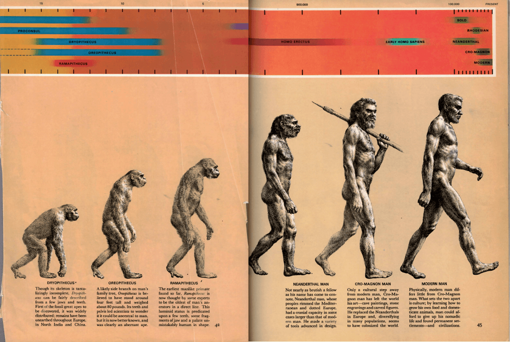
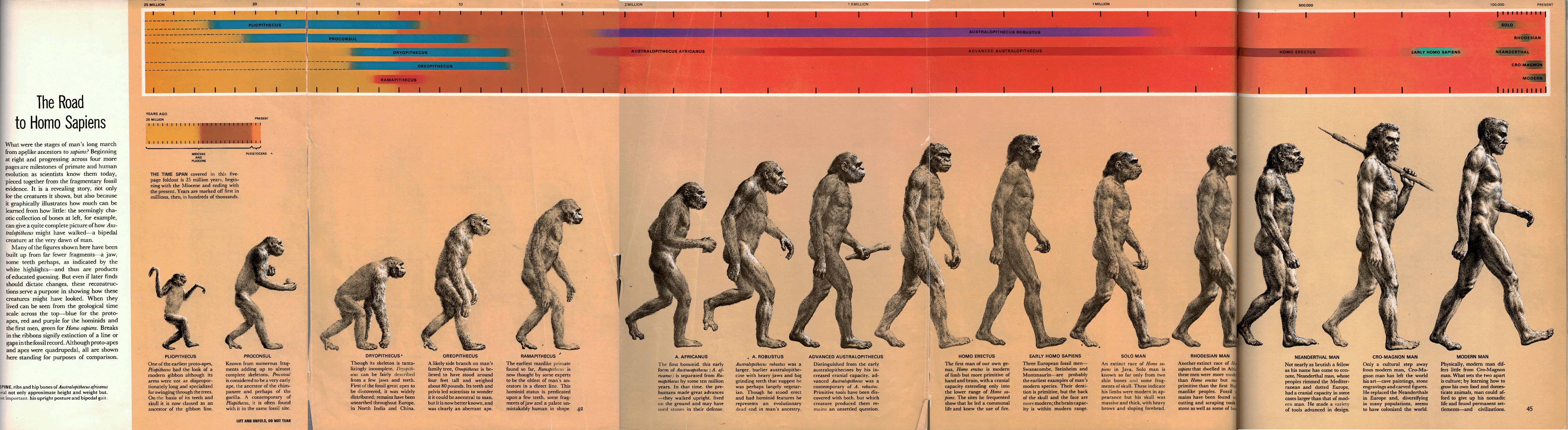
The image, titled “The Road to Homo Sapiens” though more commonly referred to as “The March of Progress,” was created by Rudolph Zallinger for Time-Life Books’ Early Man (1965) volume of the Life Nature Library. It originally appeared as a four and a half-page spread of 15 figures (Fig. 6); however, when folded up, just six figures are shown (Fig. 1). It’s this abbreviated image that has exploded into popular culture. (Note: A copy of Early Man can be checked out of Washington University’s Olin Library.)
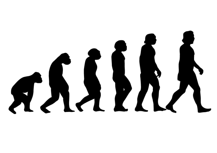
The issue with this simplified version (Fig. 2) is that it suggests that evolution is a one-dimensional process that will gradually and predictably transform organisms into “better” versions of their ancestors, with Homo sapiens as the ultimate goal. Thus, evolution becomes (incorrectly) synonymous with linear progress. This is wrong on both accounts. Evolution does not produce new species linearly; it is bush-like, with branches of varying sizes and lengths, which can grow into new branches or be cut back by the pruning shears of extinction (although, even this “tree of life” model falls apart when you factor in microbial evolution). Nor does evolution produce “better” or “higher-evolved” organisms; the species that emerge and survive do so through a combination of adaptation to their environments and chance, not by passively accumulating “improvements” over time.
In the opening chapter of his book Wonderful Life (1989), Stephen Jay Gould effectively makes this argument, proclaiming that life “is not a predictable ladder of progress.” Gould includes several examples of cartoons and advertisements that invoke “The March of Progress” to show how the illustration has invaded popular culture and, subsequently, spread the incorrect notion that evolution equals progress. Unfortunately, nearly 30 years since the publication of Wonderful Life, this practice continues.
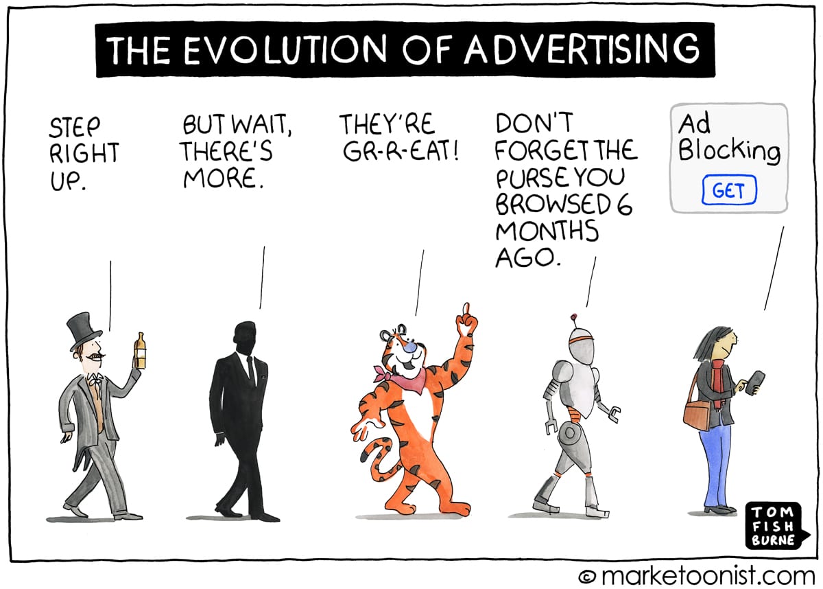
A Google search for “The evolution of” provides countless modern riffs on “The March of Progress,” and the incorrect notion that evolution is linear progress. Consider Fig. 3, from an article that details the ways each successive generation of iPhone improved over the previous model. Or Fig. 4, a 2012 Facebook ad campaign by Dr. Pepper. Or the 2006 viral video “Evolution of Dance,” which has amassed over 304 million views. Or Fig. 5, a cartoon by Tom Fishburne of Marketoonist.


The simplified version of “March of Progress” implies that each figure is a direct descendant of those behind it, and an ancestor of those in front of it—a direct line. The impression is that it’s akin to lining up pictures of your father’s father, your father, and you, albeit over several hundred million years instead of just three generations. However, the accompanying text and timeline from the original illustration in Early Man (Fig. 6) make it clear that this was not the authors’ intention. While Ramapithecus (fifth from the left) is described as “the oldest of man’s ancestors in a direct line,” the figure immediately behind it, Oreopithecus, is just a “side branch on man’s family tree,” and A. robustus, two figures ahead of Ramapithecus, “represents an evolutionary dead end in man’s ancestry.” Furthermore, the timeline above the illustration shows that many of the figures, including the first and final five, lived contemporaneously.
When you add in the time line and descriptions, instead of a direct line, the illustration becomes a line-up of several cousins, a great-aunt once removed and, somewhere in there, a great-grandfather. However, these subtleties are overshadowed by the powerful impression made by the illustration, and completely lost when the illustration is used alone—as is always the case in popular media. Hence, with proliferation of the simplified image comes the misinterpretation that evolution equals progress.
So what’s to be done about this? Should scientists crack down on all usage of this erroneous image? Should we tear off bumper stickers, throw away water bottles, and burn t-shirts printed with it? I don’t think so.
As the statistician George E. P. Box wrote, “all models are wrong but some are useful.” Is the simplified “March of Progress” wrong? Yes. But no scientific illustration—especially not one people would want printed on a t-shirt—will be 100% true. However, the image has proven itself useful in establishing the theory of evolution as a fixture pop culture. Now established, its interpretation can be refined away from “evolution equals progress” towards what the image was originally intended to portray.
Hey, great job! And as the error-prone but always nosey professor that I am, I will point out only one part that needs editing (one too many negatives): “Nor does evolution not produce “better” or “higher-evolved” organisms; the species that emerge and survive do so through a combination of adaptation to their environments and chance, not by passively accumulating “improvements” over time.” – Stan S.
Hello, Dr. Sessions! Thank you for catching that typo–and from across the pond, no less.
This article on the origins of “The March of Progress” is a captivating exploration of an iconic image that has become ingrained in our cultural consciousness. It’s fascinating to learn about the origins and evolution of this visual representation of human evolution.